
Time management on construction sites
How I redesigned time tracking for 500 construction workers — and why the sceptics ended up rolling it out themselves
Product designer
2025-2026

Monday morning, site office
The site manager is sitting at his desk sorting through a stack of slips. Some written in pen, some in pencil — a few completely illegible. One fell on the floor last week and someone stepped on it. To process them, he has to call several workers because he can't tell which entry is correct. And that's only half the site. He has several stacks like this.
This wasn't a particularly bad day. This was the norm.
Project context
The client is a general contractor for infrastructure projects — highways, industrial facilities, large-scale developments. A dozen active construction sites in parallel, 300–500+ field employees, a fleet of over 300 machines. A scale at which "just call and ask" cannot be a process.
I was solely responsible for discovery, user research, interface design, and prototyping. I worked alongside a project manager (planning, scheduling, client communication) and a development team (backend, frontend, ERP integration). This project is part of a larger system — this case study covers phase 1 only: the app for field workers.
The problem
Time tracking worked like this: each worker filled in a paper slip. Slips went to the site manager, then to the site office, then to the payroll department, then to accounting. Along the way they got lost, were filled in irregularly, and had to be manually transcribed from barely legible handwriting.
The most painful moments:
At the end of every month, 2–3 people spent 2–3 days collecting and reconciling slips from all sites — roughly 9 person-days for one single repeating task
Workers waited weeks to get confirmation of their hours — bonuses delayed, mistakes nearly impossible to fix after the fact
Site managers had no real-time visibility into attendance — only retrospectively, through slips, with a week's lag
Discrepancies required phone investigations between sites ("it says 6h here but 8h there — who's right?")
Nobody had ever counted what this cost in labour hours. But everyone knew something was wrong.
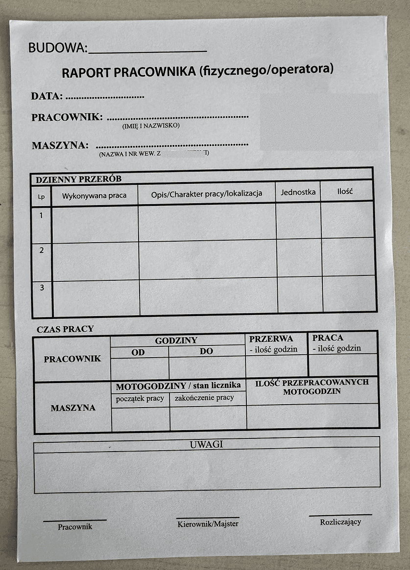
The paper slip used daily by every worker onsite.
How I understood the problem — before designing anything
The first step was a site visit. Not a project meeting — an actual visit to the site, to see how the process really worked, not how someone described it in a meeting room.
I saw: stacks of slips, binders, papers pinned to a corkboard, slips on the floor. A site manager transcribing hours from illegible notes. Workers signing slips balanced on their knees.
But the most important insight came at the goodbye.
When I shook hands with the crew at the end of the visit, I noticed that every one of them had hands like loaves of bread — massive, rough. Even large smartphones looked like toys in those hands. And just a few minutes earlier, on their break, I'd watched them on their phones — scrolling, messages, YouTube. Construction work also means waiting.
That was the moment that determined the entire interface architecture.
Beyond the field observation, before I drew a single screen, I mapped out a system context diagram. Time tracking turned out to be a far more branching process than "worker enters hours." It involved: shift planning, attendance control, overtime and weekend reconciliation, bonus calculation — and all of it had to feed into the ERP system. The context diagram showed every actor and every information flow. It told me exactly what was MVP and what came later. And it gave me a shared language with everyone involved — from the worker on
site to the accounting department.
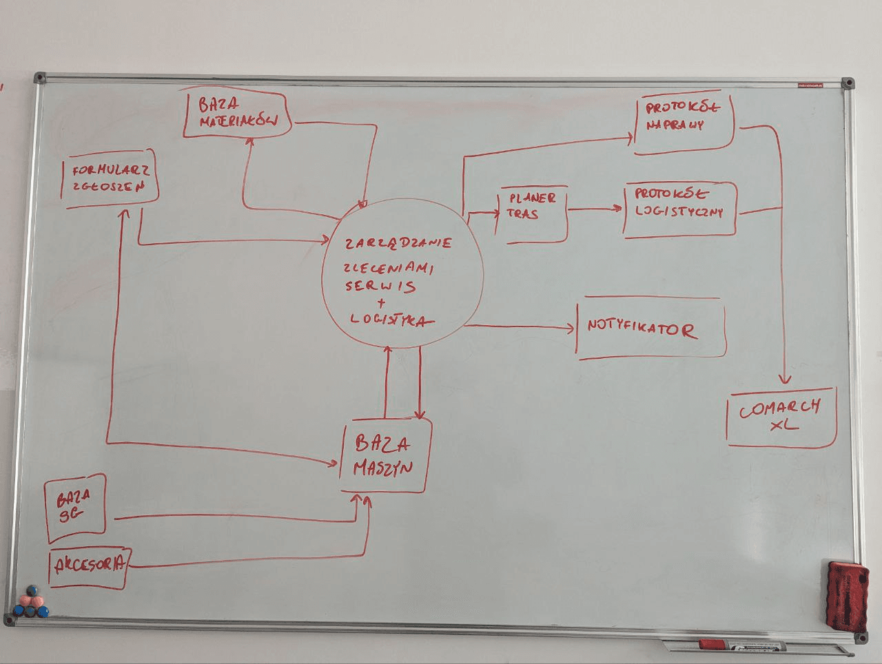
That diagram turned out to be invaluable in the months that followed. I came back to it repeatedly.
Solution
Technologies: PWA (offline-first), Figma, ShadCN, V0, Vercel, Supabase
UX principles derived from observation — not from WCAG
The field visit translated into concrete design rules you wouldn't find in any accessibility handbook:
Every action button spans the full screen width — no exceptions. Not because the guidelines say so, but because a huge thumb needs to hit the target in direct sunlight, wearing work gloves, standing next to a machine.
Maximum contrast — working in full sun is not friendly to phone displays. Scrolling over information density — better to scroll than to hit the wrong target.
PWA instead of a native app — on many sites, internet connectivity arrives late: only once power is connected and the site network is set up. The app had to work offline, store data locally, and sync in the background as soon as connectivity returned. It also had to run on any phone, including older models, without an app store install — because managing the configuration of 500 phones is a separate project.
Prototyping: Figma to V0 — and why that wasn't accidental
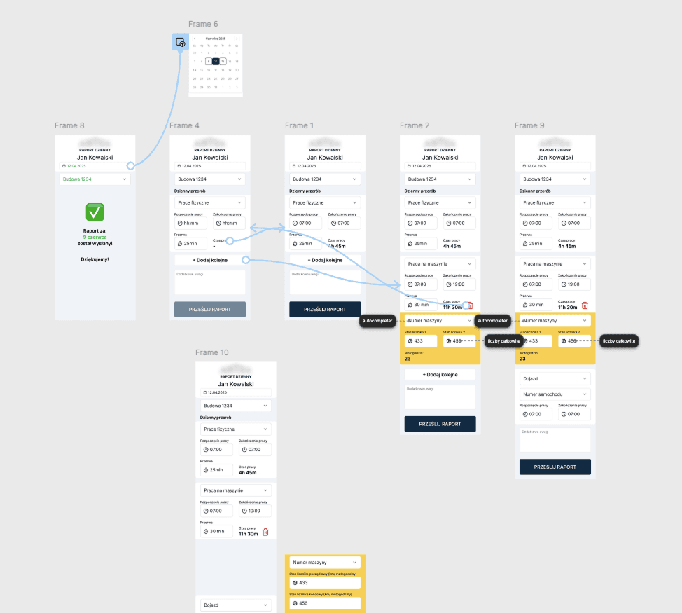
The first clickable prototype was built in Figma — the worker flow was four screens, I had existing components ready, and the prototype was done in a few hours.
I took it to users. And there I ran into resistance I hadn't anticipated.
Workers were convinced this was surveillance. That someone would track their breaks. That mistakes would be punished. Classic resistance to a new digital system — only in a construction environment it runs especially deep, because people are used to trusting their own hands and their own word, not apps.
The key decision: instead of trying to convince the workers, I focused first on the site managers. They immediately saw that instead of a stack of slips they were getting a dashboard — filters, search, bulk actions, real-time visibility. Things that were simply impossible with physical paper.
The managers took it upon themselves to roll the system out among their crews. And they found the right language: "You'll get your bonus faster," "It's easier to fix a mistake than digging through a pile of slips," "You can check your own hours whenever you want." Workers, persuaded by their direct managers, adopted the app.
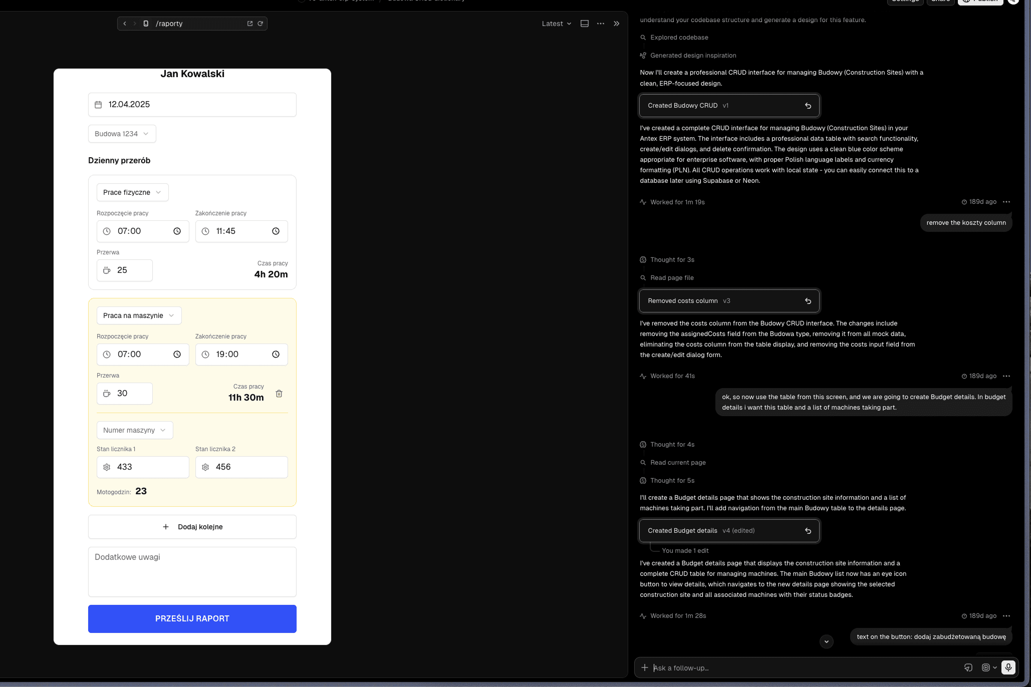
After the first round of user testing I moved from Figma to V0 + Vercel + Supabase.
This wasn't a whim — it was a decision forced by the nature of the project.
In a field app, edge cases are everywhere. What if a worker logged hours in the future? What if an offline-completed form conflicted with an existing entry on sync? What if someone entered 0 hours? Representing each of those states in Figma would require dozens of extra screens — slow and brittle, because one new edge case means one new screen and one new flow.
In V0, instead of mocking states, I built an app that generates them. Change 2–3 parameters in Supabase — and the prototype shows how the app behaves in that scenario. For real. Without any extra design work.
I chose ShadCN as the design system for a specific reason: I knew it was well "understood" by AI models — working with V0 on ShadCN was smooth and consistent, with no random deviations from the component set. A prototype built on the same design system as the target application meant the hand-off was essentially direct.
The impact of this shift was measurable: adding a new flow (10–15 screens for a new feature) took me 10% of the time the same work would have taken in Figma. Branching in Vercel let me test alternative assumptions without breaking the main prototype.
The clearest way to describe it is one specific moment: a client session would end at 3pm where I'd been gathering new requirements and edge case scenarios. By 4pm I'd sent them an updated prototype to click through. One hour from workshop to working prototype. That was a pace that simply wasn't achievable before.
Hand-off without "lost in translation"
The V0 prototype also changed how I transferred design decisions to the developers. Instead of Figma specs and comment threads, I recorded short videos: step by step, showing how each feature worked in the prototype. The video went into the product documentation alongside algorithm specifications and UML ]diagrams.
Even when the prototype crashed (because a vibe-coded prototype is not production code), developers had: video + spec. That was enough to know exactly what experience was intended and how the logic should behave.
An unexpected side effect
The pace of prototype delivery created a problem I hadn't foreseen: the client started treating developer work as "slow." If the designer can deliver a working prototype an hour after a meeting, why does a developer need a week for the same feature?
I had to go back to the system context diagram and show what "real backend with ERP integration and offline-sync logic" means compared to "a Supabase prototype." The diagram saved the client relationship — instead of frustration, they got an understanding of the architecture.
This was an important signal for me: the faster I deliver prototypes, the more important it becomes to educate the client on what a prototype represents — and what it doesn't.
Outcomes
📈 Monthly time tracking reconciliation — from ~9 person-days (several people × 2–3 days) to ~0.5 person-days for one person covering all sites simultaneously (~93% reduction — with a growing number of sites and crews)
📈 Worker → management feedback loop — from roughly one week to real-time
📈 Hour visibility for workers — from "you'll find out at month end" to checking anytime from their phone
📈 Attendance and overtime reporting — from retrospective paper-slip reconciliation to a real-time dashboard with filtering and bulk actions
The sceptical workers who initially feared surveillance became system champions — rolling it
out on new sites themselves and convincing their colleagues.


